
Web App Redesign
Web App Redesign
AgroLedger is a software created by the Canadian Sheep Federation. It is a new and innovative system designed to manage livestock traceability. It is a unique software in the agriculture technology world because farmers are heavily involved in the process of design.


Coming into the project, the website had already been built but it was confusing and unappealing. Our team was tasked to redesign the AgroLedger web app to make it more intuitive, user friendly and aesthetically appealing.
Role: UI Designer
Timeline: 8 Weeks
Platform: Web App
Team: Ali Brown and Murtaza Mehdi
Because the website had already been built, we did not have a full research process. With the information we had received we had created 3 personas to help us understand our audience.


After creating the personas we were able to conceptualize what were the major challenges that needed to be focused on. These would be the driving force behind the AgroLedger redesign.
Mobile use is important because the users will be using AgroLedger out in the field.
Make it as easy as possible to use and navigate.
These users aren’t familiar with technology (farmers).
Users don’t want to waste their time digitally tracking their animals.

We decided to start with the green colour from the already existing AgroLedger logo. Then we experimented with different hues of green. The decision behind the green colours were made by checking the contrast between the light and dark greens to make sure no matter what colour we used it would be visible to all users.

We chose to keep the same font the original website had. Roboto is a neo-grotesque sans-serif typeface, it is an open sourced font developed by Google.


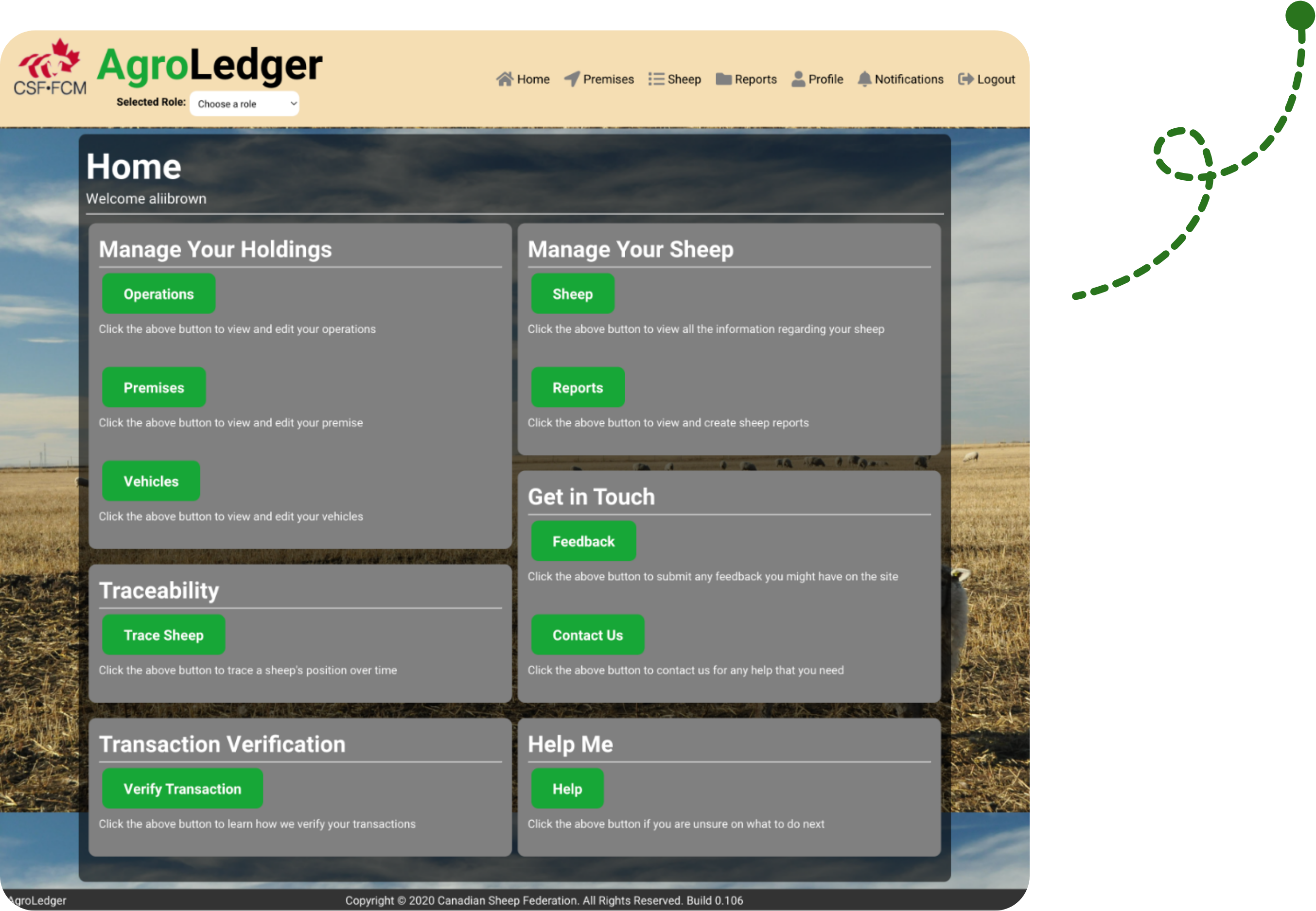
The homepage operates as a dashboard with access to all the pages on AgroLedger.
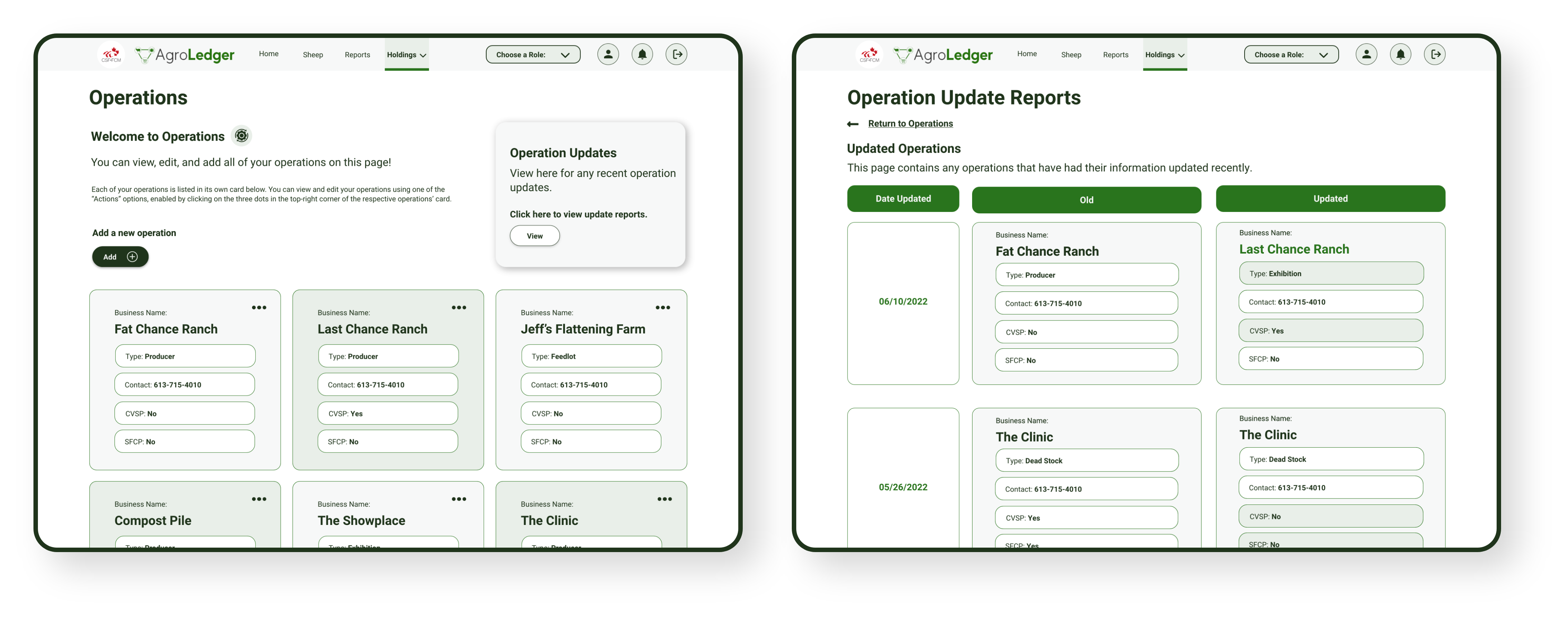

The operations page is a one of the holdings pages. It functions as a database of the different operations inputed by the users. Different accounts have access to different operation information.

The sheep dashboard functions as a database for all the sheep in the system. The users can find a specific sheep they’re looking for and find all the information about them through the here.

AgroLedger has alot of large amounts of data. This can be difficult to make responsive but it’s important to make sure AgroLedger is accessible for all devices.


